When considering paint colors for our house, I spent a lot of time online trying to find examples of those paint colors in real peoples homes. Of course everyone’s lighting is different, but it is really helpful to see how the paint might look with in different lights, in different environments, and with different color schemes.
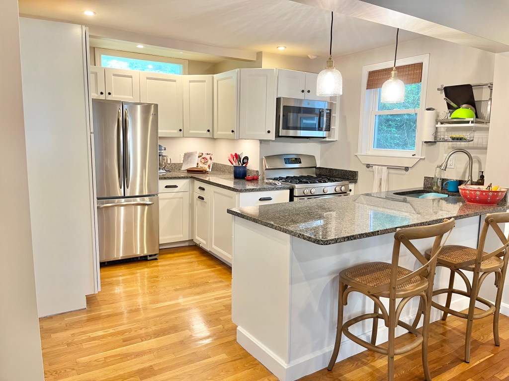
For whatever reason, Sherwin-Williams Cold Foam seems to be a very under-the-radar color, and I struggled to find any example of someone using it in real life. So that’s what today’s post is for! If you are looking for a white that is slightly creamy, slightly taupe, but still fairly bright and are curious about SW Cold Foam, here is how it looks in our house on our newly painted kitchen cabinets. It definitely reads as a bright white in real life, but if you compare it to the trim around the window, you can see that Cold Foam certainly has a little bit of creaminess to it.
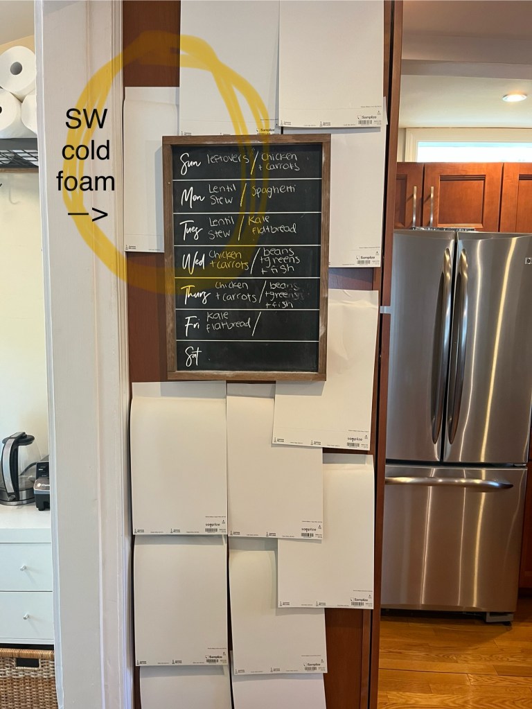
I must have ordered more than a dozen white paint swatches from Samplize. Our kitchen gets very little natural light, so it was important for the color to look flattering in artificial lighting. Prior to pulling samples, I was leaning towards BM White Dove because I’d seen so many beautiful photos of it online. However, our painter said he preferred Sherwin Williams paint for cabinets, so I pulled a bunch of SW samples as well. In the end it was between SW Heron Plume (more off-white) or SW Cold Foam (a slightly brighter white). Given the lack of natural light, we opted to play it safe and go with SW Cold Foam.

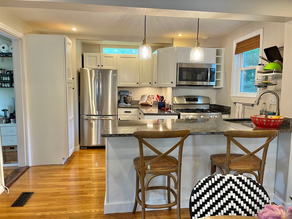
For hardware, I was torn between black (technically oil rubbed bronze) or brass. I reviewed images of Nancy Meyers’ kitchen for inspiration and she appears to have oil rubbed bronze, so that’s what we went with. Plus, it works well with our darker granite countertops, which we cannot afford to replace anytime soon.
One day down the road, I’d love to replace our countertops with Danby marble (Martha Stewart’s preferred stone, apparently) and get a zellige-inspired subway tile backsplash like this or this. For now however, the white paint, new pendant lights, new hardware, and under cabinet lighting made a world of a difference, and I’m more than content with this “kitchen facelift” for many years to come.
Sources:
- Cabinet Paint Color: Sherwin-Williams Cold Foam
- Pendant Lights: Pottery Barn Textured Glass Cord Pendant, small (6″), brass finish
- Hardware: Rejuvenation Claybourne Cabinet Knob in Oil-Rubbed Bronze & Rejuvenation Vernon Bin Pull, 6″, in Oil-Rubbed Bronze
- Counter Stools: Safavieh Franklin X Back Counter Stool (purchased on Overstock; no longer available)

Leave a reply to The $6 Hack for Testing Out Paint Colors – Bookworm Cottage Style Cancel reply